


THE BURNING MAN SYSTEM
Over the past 12 weeks, I’ve worked with the Burning Man festival to create a new visual identity that is representative of the festival’s values and its attendees, through three deliverables: a poster, printed booklet and e tickets. Based on my research, my concept was to bring the importance of craftsmanship and arts to light, and move away from the notion that this is a rich man’s paradise. It is (and should be) art focused, as it was in its prior years.
I was tasked with designing this system not only in English, but in a second language, Spanish. I had to ensure a clear differentiation between the Spanish and English text, and created a system that used typographic hierarchy and colour themes to separate the two. This created a beautiful consistency that was easy to read, and followed the same system across all three deliverables for consistency.
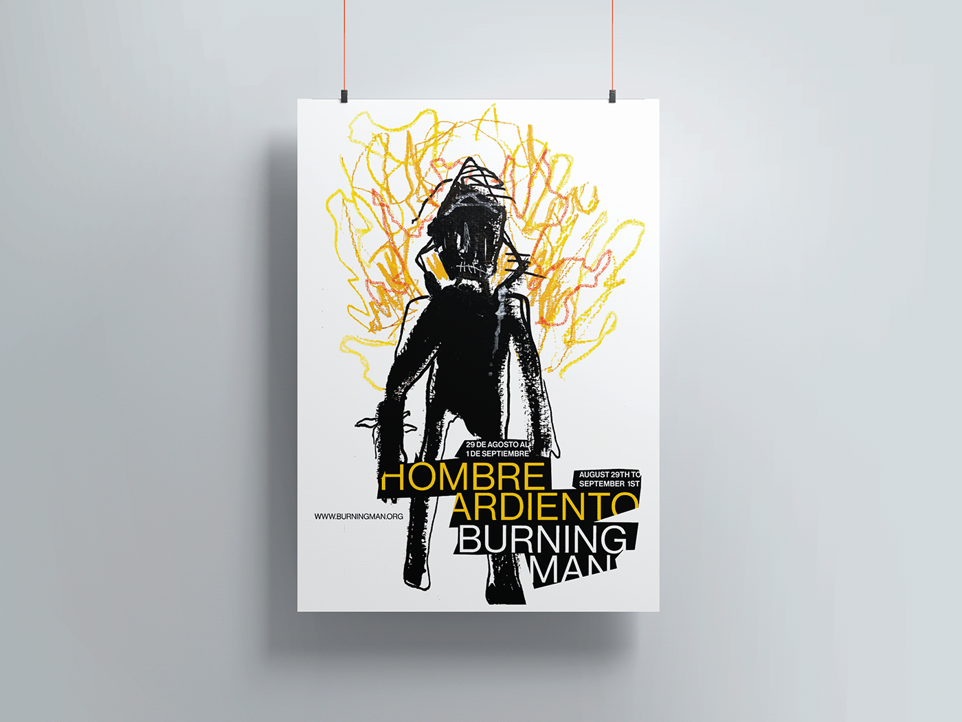
PART 1: POSTER
For the poster, I worked with representational imagery and created a hand drawn illustration of a Burning Man, which is highly reflective of the festival and it’s origins. In 1986, Artist Larry Harvey began this tradition by burning a statue of a wooden man with a few friends as an ode to summer solace. This grew over the past few decades into what is now a world renowned festival with over 80,000 yearly attendees. I wanted to bring back a sense of unique authenticity to the festival itself, and work with hand drawn images and pair them with a clean sans serif font to introduce the idea of integrating the past with the present. This poster allowed me to establish beginning of the system, through colour, type and layout hierarchies.
PART 2: E-TICKETS
The E tickets follow the same system layout, with stacked typography to show the Spanish text on top, and English on the bottom, much like its counterparts. I kept the illustrations minimal as to not overwhelm the smaller space, but integrated some hand drawn flames into the background to tie it into the poster and program.

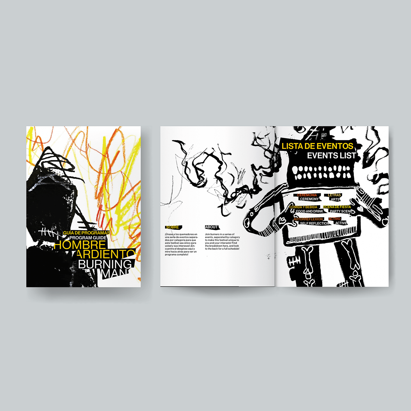
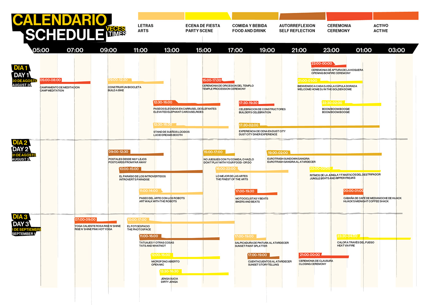
PART 3: EVENT PROGRAM
The program consisted of three elements: the events list, of over 27 individual events, a map, and schedule. For layout purposes, I added a new variation to the system of side by side text for an easier read. I split the events into 6 different categories, Ceremony, arts, food and drink, party scenes, self reflection, and activity. I used a colour coded system to do so, and this helped distinguish them across all platforms, including the map and schedule. I integrated hand drawn images that were highly representational of each event type, to tie into the Illustrative aspects of the poster, and become a unique visual element that complimented my concept of re integrating the artistic aspects of the festival back into the visual identity.

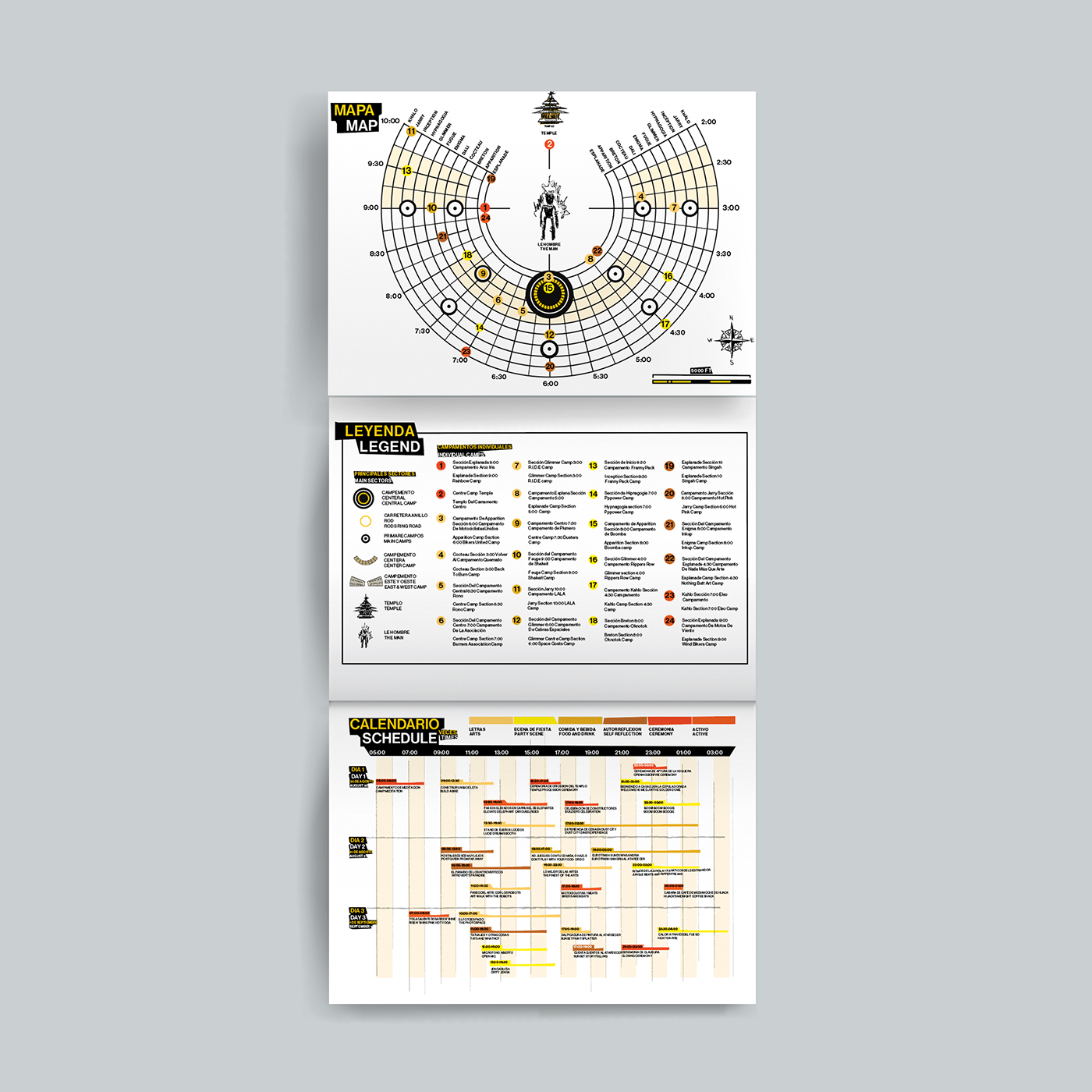
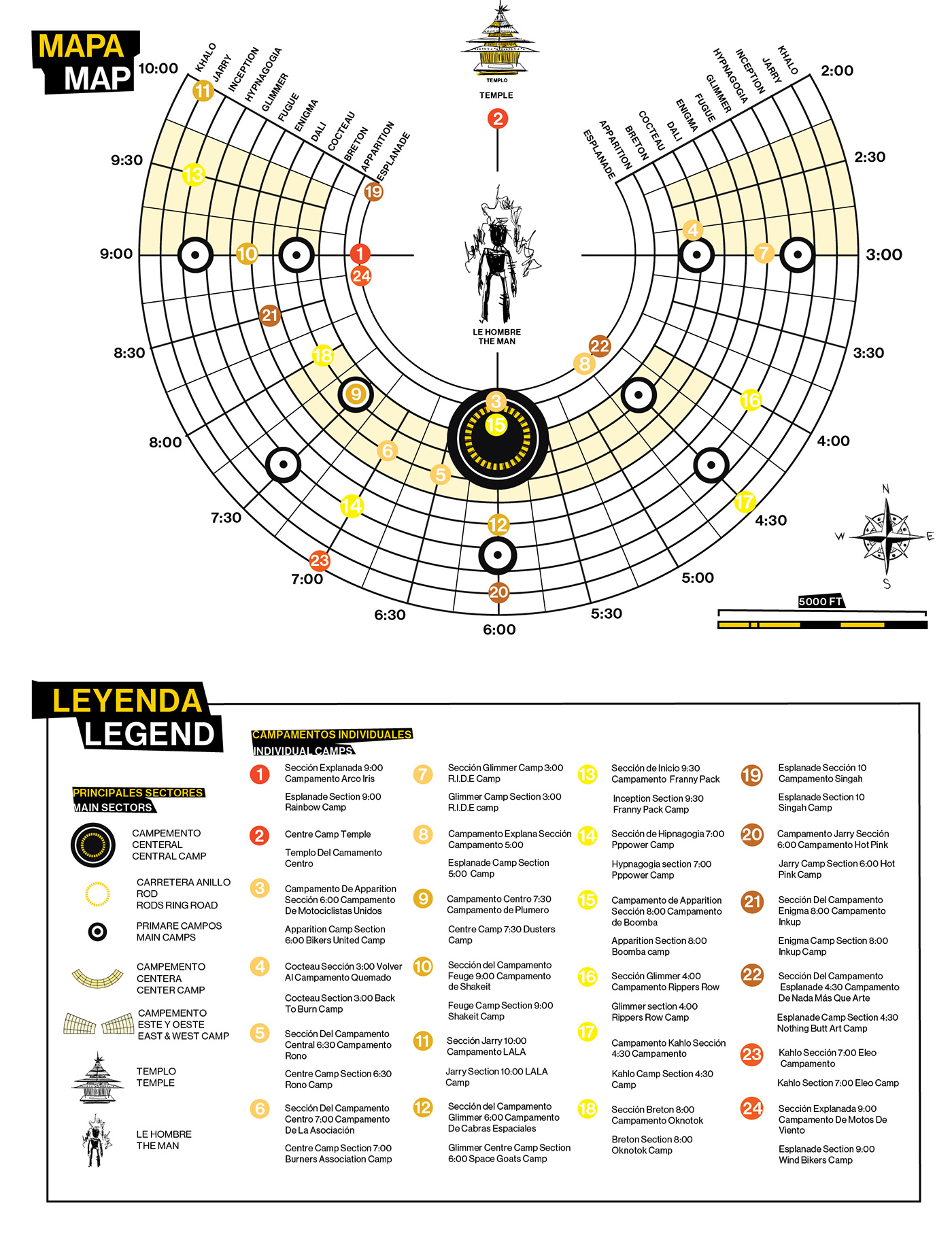
PART 3a: EVENT PROGRAM MAP & SCHEDULE
The program consisted of a unique map that was hand illustrated to show Black Rock City's circular grid system, and show each event's campsite. I methodically placed each event with its respective location, and maintained the same colour scheme through each location, to show the events and their category. I was also able to incorporate some hand drawn aspects into the map, that would tie it into the rest of the project. This map was meant to fold out at the end of the program, and show the schedule beneath it, for easy access.
PART 3b: ILLUSTRATION
Imagery was such a key part of the poster, and the spreads felt empty without it. I went ahead and hand drew aproximately 20 different images with ink, paint pen and pencil crayons, then scanned them to match the style of the poster. These images represented various different aspects of the festival, and these characters give the festival’s program a fun look, acting as a nice visual to pair with each event’s theme.
Each character was hand drawn and scanned specifically to represent a specific event type of Burning man. They are meant to follow the same style of the poster, and I used ink, paint pen, acrylic, pencil crayon and pastels to give them a rough and abstracted look, that was also highly representational.
Each character was hand drawn and scanned specifically to represent a specific event type of Burning man. They are meant to follow the same style of the poster, and I used ink, paint pen, acrylic, pencil crayon and pastels to give them a rough and abstracted look, that was also highly representational.

FINAL REMARKS
Overall, creating the Burning Man system was a very intense but incredibly rewarding process that challenged me as an artist and designer. I stepped outside of my comfort zone to create a system that was reflective of an iconic event, through type and illustration.


